Sat-Sun: Non-working days
How do meteorologists predict the weather? They look at the current weather and use mathematical modeling to determine how it will change over time. Comprehensive and up-to-date weather data is a condition for more accurate forecasts, and real-time data allows for the most objective assessment.
Let's try to act as meteorologists and create a real-time weather map. To do this, we will explore trends, learn about atmospheric processes, and forecast the weather.
The first task is to create a map with real-time weather data worldwide. For this, we will use ArcGIS Online. During the study, it was already nighttime in Russia, so we will analyze the USA.
First, we need to add data to the map. The data will come from several sources, including NOAA (National Oceanic and Atmospheric Administration) and the ArcGIS Living Atlas of the World, a collection of geographic information from Esri from around the world. These sources are considered reliable, so we can be confident that the data will be accurate.
First, add another base map, Light Gray Canvas. This base map contains less geographic information than the topographic one, so real-time weather data will stand out well on it. However, you need the ability to turn it off if more geographic context is required, so you will add it as a layer rather than a base map.
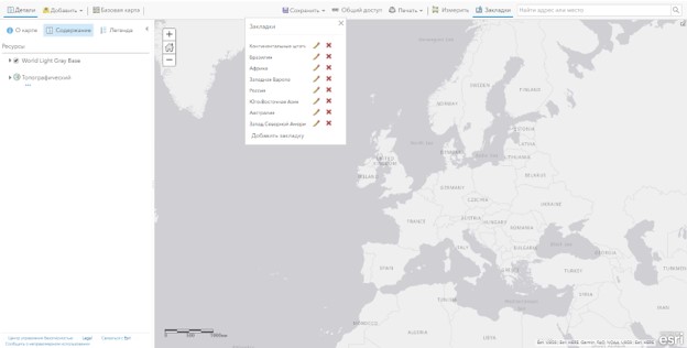
Fig. 1 Project view with gray base map
Now we need to add weather data. Let's start with images taken from the Geostationary Operational Environmental Satellite (GOES), managed by NOAA (National Oceanic and Atmospheric Administration). Find all the necessary images on the NOAA portal and add them to the project.
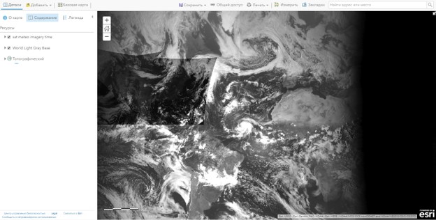
Fig. 2 Project view with added images
The metadata of the layer with the images contains a detailed description of the images, the sensors that take the images, and how often they are updated (every 30 minutes).
The images show not only what is visible to the human eye but also infrared light. Infrared sensors help display the relative warmth of objects, which is important for determining the temperature of clouds. In these images, white clouds are colder, and dark ones are warmer.
The image layer completely covers other layers. To make it more convenient to navigate the map, we will make a copy of the layer and then set the transparency to 75%.
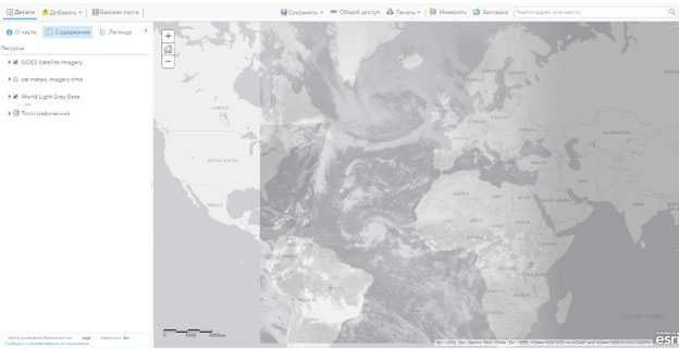
Fig.3 Project view with 75% transparency
Now add a precipitation layer. The metadata for this layer explains that it was created based on radar data (NEXRAD) located throughout the United States.
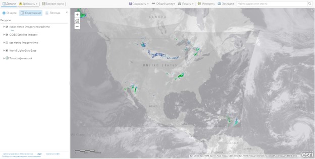
Fig. 4 Project view with added precipitation layer
These radars send radar waves that reflect off precipitation. Based on the part of the radar signal that is reflected, the time it takes for the signal to return to the radar, and how much the radar frequency changes, the radar can determine the location and intensity of precipitation. Areas of blue or light green usually indicate light rain, while darker green, yellow, orange, and red colors tend to indicate increasingly heavy rain. The data is updated every 4 minutes.
Next, add a layer with active hurricanes.
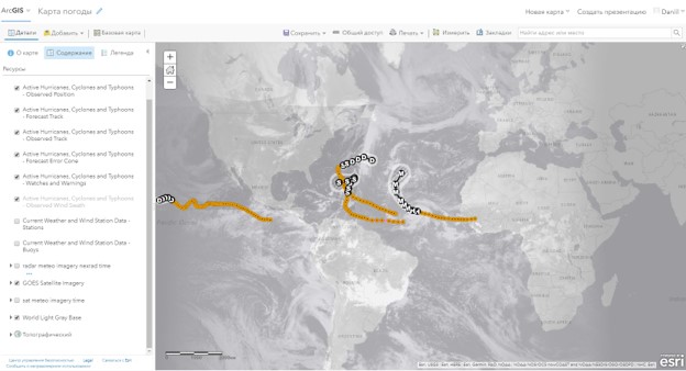
Fig. 5 Project view with hurricane data
Orange dots show the observed hurricane track. Black dots and text indicate the predicted hurricane path. The gray area indicates possible forecast errors. The data was collected by NOAA but is stored in the Living Atlas. The layer is updated every 15 minutes.
Next, add wind data (speed and direction).
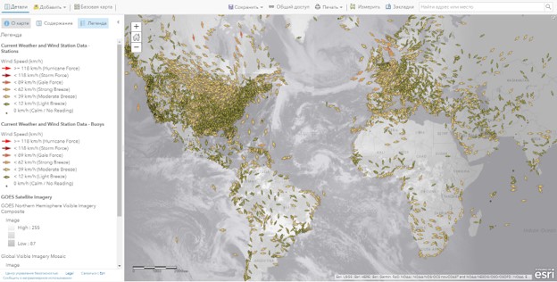
Fig. 6 Project view with wind data
This layer covers the entire world, although not evenly. Each arrow or dot represents either a weather station (on land) or a weather buoy (at sea). The direction on the territory indicates the wind direction, and the color indicates the speed.
Creating additional layers
We have added a lot of data. But the project lacks layers representing atmospheric pressure and temperature - necessary components of weather and weather analysis. Fortunately, the wind speed and direction layer contains data on these components. We will study the available data, copy the layer, and set up symbols to display the corresponding parameter.
The attribute table contains up-to-date information about air temperature and atmospheric pressure. We will make a copy of the layer for each parameter.
The copied layers have the same symbols as the original layer. Now we will change the symbols of both layers so that points only display the locations of stations and buoys. Later we will use more complex styles to display the data to make it useful for analysis. In the layer display settings, we will only leave the location display.
Finally, add state and county boundaries for the United States. These layers will add geographic context to the map and will be useful for analysis if you need to study the weather in a specific geographic area.
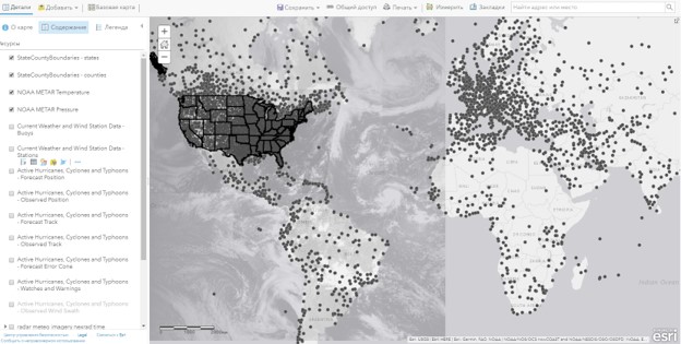
Fig. 7 Project view with weather stations displayed
We have created a map with a large amount of weather data: precipitation, hurricanes, wind speed and direction, pressure, temperature, and satellite images. This data is automatically updated by sensors and radars around the world. Next, we will explore and learn more about the patterns of weather conditions visible on the map and try to predict the future weather.
Let's start by looking for patterns in the data. Accurate weather forecasts depend on what features and patterns are observed now. First, study the temperature layer.
Earlier, we designated this layer so that all points were displayed with the same symbol. Now change the symbols so that warmer and colder temperatures have different colors. In the layer display settings, select the dependency of the conditional signs on the air temperature and choose the color gradient. Now the air temperature is displayed from cool yellow to warm red.
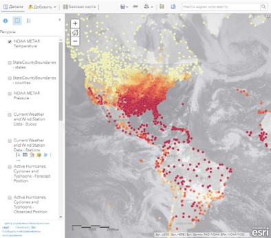
Fig. 8 Temperature data for the USA
In the USA, the temperature directly depends on latitude. The farther north the point is, the colder
